Contents
Overview
dasher: Generate interactive plotly dash dashboards in an instant
| docs | |
|---|---|
| tests |   |
| package |      |
Installation
pip install dasher
You can also install the in-development version with:
pip install https://github.com/mfaafm/dasher/archive/master.zip
First steps
Creating a simple, interactive dashboard with a nice layout is as easy as this:
from dasher import Dasher
import dash_html_components as html
app = Dasher(__name__, title="My first dashboard")
@app.callback(
_name="My first callback",
_desc="Try out the widgets!",
_labels=["Greeting", "Place"],
text="Hello",
place=["World", "Universe"],
)
def my_callback(text, place):
msg = "{} {}!".format(text, place)
return [html.H1(msg)]
if __name__ == "__main__":
app.run_server(debug=True)
The resulting dashboard looks like this:
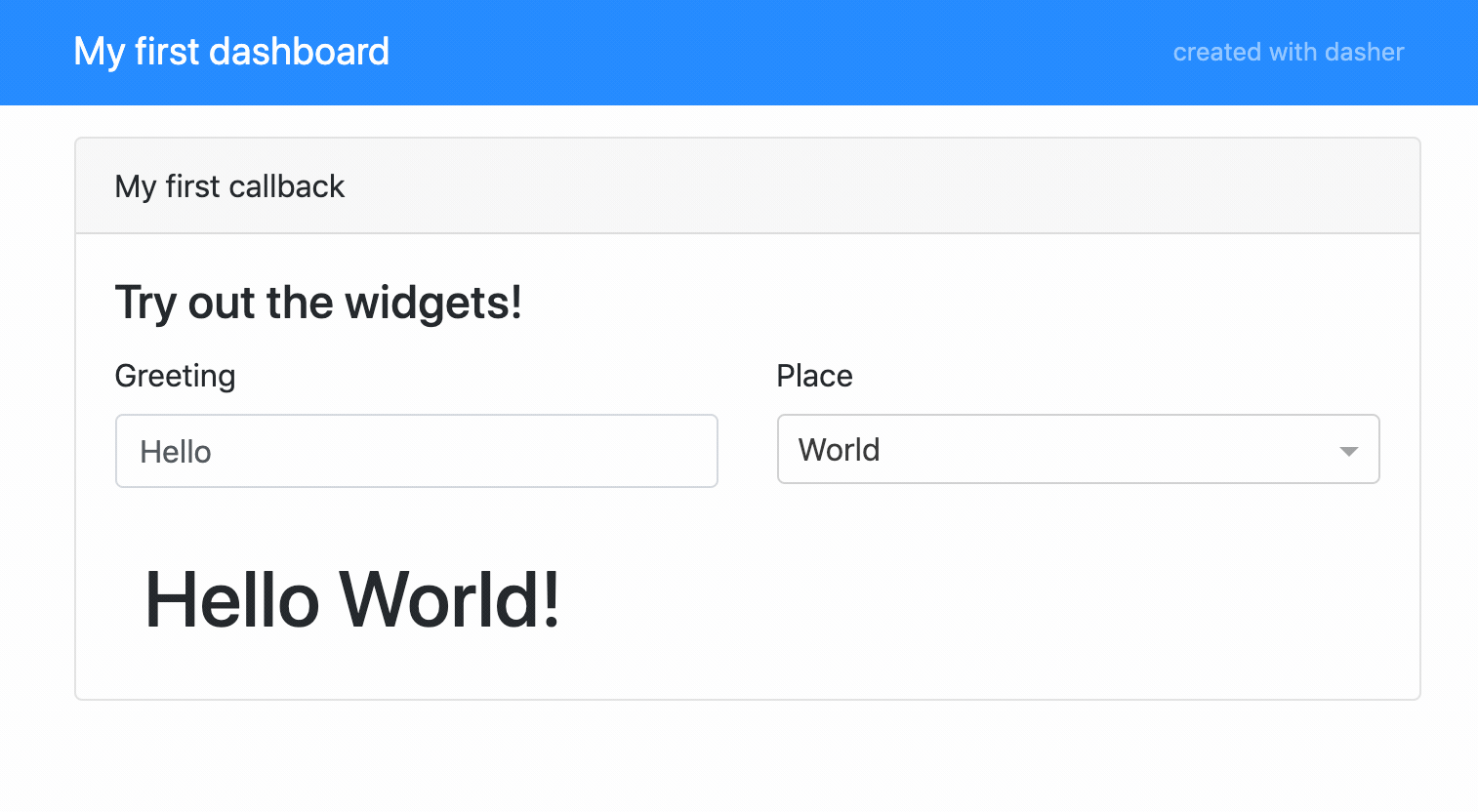
The code for this dashboard can be found in examples/readme_example.py.
Documentation
To view the full project documentation, visit https://dasher.readthedocs.io/.
License
Free software, MIT License
Development
To run the all tests run:
tox
Note, to combine the coverage data from all the tox environments run:
| Windows | set PYTEST_ADDOPTS=--cov-append
tox
|
|---|---|
| Other | PYTEST_ADDOPTS=--cov-append tox
|
Concept
The idea behind dasher is to create auto-generated interactive plotly dash dashboards as easy as using the ipywidgets interact decorator in jupyter notebooks. That is, by decorating a user defined callback function! Here, the keyword arguments of the decorator define the interactive widgets and the callback function must return what you want to show in the content container in the dashboard.
Dasher automatically renders a layout consisting of a header with the dashboard’s title, a widget container providing the interactivity and the content container. The only thing you need to do in the callback function is to process the input arguments (which correspond to the widgets) and to return a list of the plotly dash components that you want to appear in the content container!
The interactive widgets are automatically generated based on the type of the keyword
arguments of the decorator. For example, a string will result in an input field and
a list will become a dropdown box. Dasher supports the same widget abbreviations as
ipywidgets interact, see their widget abbreviations.
Since the layout and the widget connections to the callback are taken care of by dasher, you can concentrate on what you to display on the dashboard. As a result, generating a stunning interactive visualization becomes a matter of minutes!
Dasher API
The functionality of the dasher.Dasher class is built upon the dasher
dasher.Api class. The latter implements the generation of widgets and callback
dependencies. It has convenience methods to generate widgets in unstyled
(basic dash components) and styled (as used in the dasher layout) versions. Hence, you
can use dasher to generate widgets quickly, while still using a fully custom dash
layout by using the dasher.Api directly!
Usage
Getting started
Creating a simple, interactive dashboard with a nice layout is as easy as this:
from dasher import Dasher
import dash_html_components as html
app = Dasher(__name__, title="My first dashboard")
@app.callback(
_name="My first callback",
_desc="Try out the widgets!",
_labels=["Greeting", "Place"],
text="Hello",
place=["World", "Universe"],
)
def my_callback(text, place):
msg = "{} {}!".format(text, place)
return [html.H1(msg)]
if __name__ == "__main__":
app.run_server(debug=True)
The resulting dashboard looks like this:

The code for this dashboard can be found in examples/readme_example.py.
Callbacks
In general, a dasher callback is responsible for automatically generating an interactive layout (including widgets) and connecting the generated widget to the decorated callback function, so that it is executed when the state of the widget changes. The callback function must return a list of dash components, which define the content that is dependent on the widget state.
The layout of a callback contains:
- a navbar with the app title
- the name of the callback (
_name) - the (optional) description of the callback (
_desc) - the automatically generated widgets
- the main content area, which is defined by the return value of the callback
Supported widgets
The type of a keyword argument of the callback decorator determines which widget
will be generated. All supported types and the resulting widget (dash component)
are:
bool: Radio Itemsstr: Input fieldint: Slider, integerfloat: Slider, floatstuple: Slider Can be (min, max) or (min, max, step). The type of all the tuple entries must either beintorfloat, which determines whether an integer or float slider will be generated.collections.Iterable: Dropdown menu Typically alistor anything iterable.collections.Mapping: Dropdown menu Typically adict. A mapping will use the keys as labels shown in the dropdown menu, while the values will be used as arguments to the callback function.dash.development.base_component.Component: custom dash component Any dash component will be used as-is. This allows full customization of a widget if desired. The widgetsvaluewill be used as argument to the callback function.
For a demo of all supported automatic widgets and an example how to use custom
components, see examples/widget_demo.py.
Multiple callbacks
dasher supports multiple callbacks and will autmatically create tabs to separate the
content of the callbacks.
An example dashboard with two callbacks can be found in examples/plot_demo.py
and it looks like this:

Customizations
dasher has many options for customizations, including:
- support for native dash components and custom widgets
- removal of the credits link in the navbar
- layout options on a global level (number of columns to display the widgets in)
- layout options on a callback level
- customization of the widget specification
Refer to the Reference for details or have a look at the customization example in
examples/customization_example.py, which shows some of the possible customizations.
Dasher API
The dasher.Api can be used to use dasher’s widget auto generation features
with a fully custom layout. See examples/api_example.py for an (arguably not very
useful) example.
Reference
Dasher
-
class
dasher.Dasher(name, title=None, layout='bootstrap', layout_kw=None, dash_kw=None)[source]¶ Dasher app. Allows building of simple, interactive dash apps with minimal effort. A tab is created by decorating a callback function, which returns the content layout in the form of a list of dash components. Interactive widgets to control the arguments of the callback function are generated automatically. The type of widgets are determined based on the types of the keyword arguments (compatible to the
ipywidgets.interactdecorator).Parameters: - name (str) – Name of the app, typically __name__.
- title (str, optional) – Title of the app.
- layout (str or DasherLayout subclass, optional) – Name of a built-in layout or custom layout (DasherLayout subclass)
- layout_kw (dict, optional) – Dictionary of keyword arguments passed to the layout class.
- dash_kw (dict, optional) – Dictionary of keyword arguments passed to the dash app.
Variables: - api (dasher.Api) – The
dasher.Apiinstance used for generating the app. - app (dash.Dash) – The dash app.
- callbacks (dict of Callback) – Dictionary containing the registered callbacks.
-
callback(_name, _desc=None, _labels=None, _layout_kw=None, **kwargs)[source]¶ Decorator, which defines a callback function. Each callback function results in a tab in the app. The keywords arguments are the input arguments of the callback function. Simultaneously, the types of each keyword defines which interactive widgets are generated for the tab.
The decorated callback function must return a list of dash components. It defines the content of the tab, which is controlled by the generated interactive widgets.
Supported widget types are determined by the layouts’ widget specification. The built-in widget specifications are compatible with
ipywidgets.interactand support the following types, which generate the corresponding widgets:bool: Boolean choice / Radio Itemsstr: Input fieldint: Slider, integerfloat: Slider, floatstuple: Slider Can be (min, max) or (min, max, step). The type of all the tuple entries must either beintorfloat, which determines whether an integer or float slider will be generated.collections.Iterable: Dropdown menu Typically alistor anything iterable.collections.Mapping: Dropdown menu Typically adict. A mapping will use the keys as labels shown in the dropdown menu, while the values will be used as arguments to the callback function.dash.development.base_component.Component: custom dash component Any dash component will be used as-is. This allows full customization of a widget if desired. The componentsvaluewill be used as argument to the callback function.
Parameters: - _name (str) – Name of the callback.
- _desc (str, optional) – Optional description of the callback.
- _labels (list or dict, optional) – Labels for the widgets. May be either a list of labels for the keywords
**kwargs in the order of appearance or a dictionary mapping keywords to
the desired labels. If
None, the keywords are used for the labels directly. - _layout_kw (dict, optional) – Dictionary of keyword arguments passed to the
add_callbackmethod of the layout, which may be used to override layout defaults for individual callbacks. - kwargs – Keyword arguments that are the input arguments to the callback function, which also define the widgets that are generated for the dashboard. Obviously, reserved keywords are _name, _desc, _labels and _layout.
Returns: function_wrapper (callable) – Wrapped function that generates a dashboard tab.
See also
layout.bootstrap.widgets.WIDGET_SPEC()- Bootstrap widget specification
layout.bootstrap.layout.BootstrapLayout()- Bootstrap layout
-
run_server(*args, **kw)[source]¶ Runs the dasher app server by calling the underlying
dash.Dash.run_servermethod. Refer to the documentation ofdash.Dash.run_serverfor details.Parameters: - args – Positional arguments passed to
dash.Dash.run_server. - kw – Keyword arguments passed to
dash.Dash.run_server.
- args – Positional arguments passed to
Api
-
class
dasher.Api(title=None, layout='bootstrap', layout_kw=None)[source]¶ Dasher api. The api allows generation of widgets and dash dependencies (for instances of
DasherCallback). It is used byDasherto generate interactive apps.Parameters: - title (str, optional) – Title of the app.
- layout (str or DasherLayout subclass, optional) – Name of a built-in layout or custom layout (DasherLayout subclass)
- layout_kw (dict, optional) – Dictionary of keyword arguments passed to the layout class.
-
static
generate_dependencies(widgets, output_id, output_dependency='children')[source]¶ Generate input and output dependencies for a list of widgets. It generates an
dash.dependencies.Inputfor each widgets’ underlying dash component using thevalueproperty. Andash.dependencies.Outputis generated for output_id using thechildrenproperty.Parameters: - widgets (list of BaseWidget) – List of dasher widgets to generate dependencies for.
- output_id (str) – Id of the output.
- output_dependency (str, optional) – Property for the output dependency.
Returns: - output (dash.dependencies.Output) – Generated output dependency.
- input_list (list of dash.dependencies.Input) – List of generated input dependencies.
-
generate_widget(name, x, label=None)[source]¶ Generate a dasher widget, which is a styled and labeled interactive component.
The type of the interactive component is determined based on the type of x using the selected widget specification of the layout.
Parameters: - name (str) – Name of the widget.
- x (object of supported type) – Object used to determine which interactive component is returned.
- label (str or None, optional) – Label of the component.
Returns: dasher.base.BaseWidget – Generated dasher widget.
See also
get_widget()- Generates widget and returns the
layoutof the widget. get_component()- Generates widget and returns the widgets’
component.
-
generate_widgets(kw, labels=None, group=None)[source]¶ Generate dasher widgets based on a dictionary.
Parameters: - kw (dict) – The keys of the dictionary define the names of the widgets and the type of the values is used to determine the type of the interactive widgets based on the selected component specification.
- labels (list or dict, optional) – Labels for the widgets. May be either a list of labels for kw in the order
of appearance or a dictionary mapping the keys of kw to the desired
labels. If
None, the keys of kw are used for the labels directly. - group (str, optional) – If not
None, group will be used as a suffix for each component / widget name in order to group widgets.
Returns: list of dasher.base.BaseWidget – List of generated dasher widgets.
See also
get_widgets()- Generates widgets and returns the
layoutof the widgets. get_components()- Generates widgets and returns the
componentof the widgets.
-
get_component(name, x)[source]¶ Generate an interactive dash component. This is a convenience method, which first calls the
generate_widgetmethod and then directly returns the un-styled and un-labeledcomponentof the widget.Parameters: - name (str) – Name of the component.
- x (object of supported type) – Object used to determine which interactive component is returned.
Returns: dash.development.base_component.Component – Generated dash component.
-
get_components(kw, labels=None, group=None)[source]¶ Generate interactive components based on a dictionary. This is a convenience method, which first calls the
generate_widgetsmethod and then directly returns a list containing the un-styled and un-labeledcomponentof the widgets.Parameters: - kw (dict) – The keys of the dictionary define the names of the widgets and the type of the values is used to determine the type of the interactive widgets based on the selected component specification.
- labels (list or dict, optional) – Labels for the widgets. May be either a list of labels for kw in the order
of appearance or a dictionary mapping the keys of kw to the desired
labels. If
None, the keys of kw are used for the labels directly. - group (str, optional) – If not
None, group will be used as a suffix for each component / widget name in order to group widgets.
Returns: list of dash.development.base_component.Component – List of generated interactive components.
-
get_widget(name, x, label=None)[source]¶ Generate a styled and labeled interactive dash component. This is a convenience method, which first calls the
generate_widgetmethod and then directly returns thelayoutof the widget.Parameters: - name (str) – Name of the component.
- x (object of supported type) – Object used to determine which interactive component is returned.
- label (str or None, optional) – Label of the component.
Returns: dash.development.base_component.Component – Generated dash component.
-
get_widgets(kw, labels=None, group=None)[source]¶ Generate interactive widgets based on a dictionary. This is a convenience method, which first calls the
generate_widgetsmethod and then directly returns a list containing thelayoutof the widgets.Parameters: - kw (dict) – The keys of the dictionary define the names of the widgets and the type of the values is used to determine the type of the interactive widgets based on the selected component specification.
- labels (list or dict, optional) – Labels for the widgets. May be either a list of labels for kw in the order
of appearance or a dictionary mapping the keys of kw to the desired
labels. If
None, the keys of kw are used for the labels directly. - group (str, optional) – If not
None, group will be used as a suffix for each component / widget name in order to group widgets.
Returns: list of dash.development.base_component.Component – List of generated interactive components.
Layouts
BootstrapLayout
-
class
dasher.layout.bootstrap.BootstrapLayout(title, widget_spec=OrderedDict([((<class 'dash.development.base_component.Component'>, <class 'dasher.base.CustomWidget'>), <class 'dasher.layout.bootstrap.widgets.PassthroughWidget'>), (<class 'bool'>, <class 'dasher.layout.bootstrap.widgets.BoolWidget'>), (<class 'str'>, <class 'dasher.layout.bootstrap.widgets.StringWidget'>), ((<class 'numbers.Real'>, <class 'numbers.Integral'>), <class 'dasher.layout.bootstrap.widgets.NumberWidget'>), (<class 'tuple'>, <class 'dasher.layout.bootstrap.widgets.TupleWidget'>), (<class 'collections.abc.Iterable'>, <class 'dasher.layout.bootstrap.widgets.IterableWidget'>)]), credits=True, include_stylesheets=True, widget_cols=2)[source]¶ Dasher boostrap layout. This layout utilizes
dash_bootstrap_componentsto build the app layout.Parameters: - title (str) – Title of the app.
- widget_spec (OrderedDict, optional) – Widget specification.
Default:
dasher.layout.bootstrap.widgets.WIDGET_SPEC. - credits (bool, optional) – If true, shows a link to dasher’s github page in the navigation bar. Default: True.
- include_stylesheets (bool, optional) – If true, includes the standard bootstrap theme as external stylesheets. Set it to false to use a customized bootstrap theme. Default: True.
- widget_cols (int, optional) – Group the interactive components into
widget_colsnumber of columns. Default: 2.
Variables: - widget_cols (int) – Group the interactive components into
widget_colsnumber of columns. - include_stylesheets (bool) – If true, includes the standard bootstrap theme as external stylesheets.
- external_stylesheets (list of str, optional) – Only present of include_stylesheets is
True. It contains a list with the standard bootstrap theme as its’ only value. - navbar (dash_bootstrap_components.NavbarSimple) – Navigation bar of the layout.
- body (dash_bootstrap_components.Container) – Container for the body of the app, containing the tab control and the tab contents div.
- layout (dash_html_components.Div) – Layout of the app. The div contains navbar and body.
- tabs (dash_bootstrap_components.Tabs) – Tab control to separate the layout of the callbacks.
- tabs_content (dash_html_components.Div) – Content div used to render the selected tab.
- callbacks (dict of DasherCallback) – Dictionary containing the callbacks present in the layout.
-
add_callback(callback, app, **kwargs)[source]¶ Add callback to the layout.
Parameters: - callback (DasherCallback) – The dasher callback to add to the layout.
- app (dash.Dash) – The dash app.
- **kwargs – Keyword arguments to override default layout settings for a callback.
-
render_callback(name)[source]¶ Callback method to switch between tabs.
Parameters: name (str) – Name of the callback to render. Returns: dash.development.base_component.Component – Layout of the callback.
-
render_card(callback, **kwargs)[source]¶ Renders a card with the interactive components and the output container.
Parameters: - callback (dasher.base.Callback) – The callback to render the card for.
- **kwargs – Keyword arguments to override default layout settings.
Returns: dash_bootstrap_components.Card – Layout of the card.
Widgets and WIDGET_SPEC
Widget specification and implementation of the interactive
dasher widgets based on dash_bootstrap_components.
The widget specification supports the following types and generates the corresponding interactive widgets:
bool: Radio Itemsstr: Input fieldint: Slider, integerfloat: Slider, floatstuple: Slider Can be (min, max) or (min, max, step). The type of all the tuple entries must either beintorfloat, which determines whether an integer or float slider will be generated.collections.Iterable: Dropdown menu Typically alistor anything iterable.collections.Mapping: Dropdown menu Typically adict. A mapping will use the keys as labels shown in the dropdown menu, while the values will be used as arguments to the callback function.dash.development.base_component.Component: custom dash component Any dash component will be used as-is. This allows full customization of a widget if desired. The widgetsvaluewill be used as argument to the callback function.
-
class
dasher.layout.bootstrap.widgets.BoolWidget(name, x, label=None, dependency='checked')[source]¶ RadioItems component used for booleans.
Parameters: - name (str) – Name of the widget.
- x (tuple of int or float) – Tuple used to configure the slider.
- label (str, optional) – The label for the component.
- dependency (str, optional) – The attribute used for the
dash.dependencies.Inputdependency. Default: “checked”.
-
component¶ Abstract property. The implementation of the getter method in the child class must return the concrete component.
Returns: dash.development.base_component.Component – Generated dash component.
-
layout¶ Abstract property. The implementation of the getter method in the child class must return the final layout of the widget.
Returns: dash.development.base_component.Component – Generated dash component.
-
class
dasher.layout.bootstrap.widgets.BootstrapWidget(name, x, label=None, dependecy='value')[source]¶ Abstract base class for Bootstrap widgets. Implements the default layout property, which is used by most the widgets.
-
layout¶ Abstract property. The implementation of the getter method in the child class must return the final layout of the widget.
Returns: dash.development.base_component.Component – Generated dash component.
-
-
class
dasher.layout.bootstrap.widgets.IterableWidget(name, x, label=None, dependecy='value')[source]¶ Dropdown component used for iterables and mappings.
-
component¶ Abstract property. The implementation of the getter method in the child class must return the concrete component.
Returns: dash.development.base_component.Component – Generated dash component.
-
-
class
dasher.layout.bootstrap.widgets.NumberWidget(name, x, label=None, dependency='value')[source]¶ Widget used for numbers.
-
class
dasher.layout.bootstrap.widgets.PassthroughWidget(name, x, label=None)[source]¶ Passthrough for custom dash components.
-
class
dasher.layout.bootstrap.widgets.StringWidget(name, x, label=None, dependecy='value')[source]¶ Input field component used for for strings.
-
component¶ Abstract property. The implementation of the getter method in the child class must return the concrete component.
Returns: dash.development.base_component.Component – Generated dash component.
-
-
class
dasher.layout.bootstrap.widgets.TupleWidget(name, x, label=None, dependency='value', slider_max_ticks=8, slider_float_steps=60)[source]¶ Slider components used for tuples of numbers.
Parameters: - name (str) – Name of the widget.
- x (tuple of int or float) – Tuple used to configure the slider.
- label (str, optional) – The label for the component.
- dependency (str, optional) – The attribute used for the
dash.dependencies.Inputdependency. Default: “value”. - slider_max_ticks (int, default 8) – Maximum number of ticks to draw for the slider.
- slider_float_steps (int, default 60) – Number of float steps to use if step is not defined explicity.
-
component¶ Abstract property. The implementation of the getter method in the child class must return the concrete component.
Returns: dash.development.base_component.Component – Generated dash component.
-
dasher.layout.bootstrap.widgets.WIDGET_SPEC= OrderedDict([((<class 'dash.development.base_component.Component'>, <class 'dasher.base.CustomWidget'>), <class 'dasher.layout.bootstrap.widgets.PassthroughWidget'>), (<class 'bool'>, <class 'dasher.layout.bootstrap.widgets.BoolWidget'>), (<class 'str'>, <class 'dasher.layout.bootstrap.widgets.StringWidget'>), ((<class 'numbers.Real'>, <class 'numbers.Integral'>), <class 'dasher.layout.bootstrap.widgets.NumberWidget'>), (<class 'tuple'>, <class 'dasher.layout.bootstrap.widgets.TupleWidget'>), (<class 'collections.abc.Iterable'>, <class 'dasher.layout.bootstrap.widgets.IterableWidget'>)])¶ Widget specification.
Base classes
-
class
dasher.base.BaseLayout(title, widget_spec, credits=True)[source]¶ Abtract base class of a dasher layout, which is responsible for creating the layout of the dasher app.
The widget specification (widget_spec) is used to determine the types and the layout of the automatically generated interactive widgets.
A layout class also handles the addition of callbacks via the add_callback method and creates a suitable form of separation between the callbacks in the app layout. The standard way to do this is to generate a separate tab for each callback.
A child class must implement the abtract add_callback method and create the final app layout as its’
layoutattribute. If the layout needs external stylesheets, the child class must announce this by creating an external_stylesheets attribute containing the list of required external stylesheets.Parameters: - title (str) – Title of the dash app.
- widget_spec (OrderedDict) – Widget specification used to determine the types of the interactive widgets.
- credits (bool) – If true, dasher / layout credits are shown in the app.
Variables: - title (str) – Title of the dash app.
- credits (bool) – If true, dasher / layout credits are shown in the app.
- layout (list of dash.development.base_component.Component) – The final app layout (is assigned to the
layoutproperty of the dash app).
-
add_callback(callback, app, **kwargs)[source]¶ The implementation must handle the addition of callbacks to the layout and provide a suitable form of separation between the callbacks in the app layout. The standard way to do this is to generate a separate tab for each callback.
Parameters: - callback (Callback) – The callback to add to the layout.
- app (dash.Dash) – The dash app.
- **kwargs – Keyword arguments to override default layout settings for a callback.
-
class
dasher.base.BaseWidget(name, x, label=None, dependecy='value')[source]¶ Abstract base class of a dasher widget. A dasher widget is an interactive control, which consists of an interactive dash component, a label and a final layout.
Parameters: - name (str) – Name of the widget.
- x (object) – The object, whose type determines the type of the widget.
- label (str) – The label for the dash component.
- layout (dash.development.base_component.Component) – The layout is a styled and labeled version of component.
- dependency (str, optional) – The attribute used for the
dash.dependencies.Inputdependency. Default: “value”.
Variables: - name (str) – Name of the widget.
- x (object) – The object, whose type determines the type of the widget.
- component (DasherComponent) – The interactive dash component.
- label (str) – The label for the dash component.
- layout (dash.development.base_component.Component) – The layout is a styled and labeled version of component.
- dependency (str, optional) – The attribute used for the
dash.dependencies.Inputdependency. Default: “value”.
-
component¶ Abstract property. The implementation of the getter method in the child class must return the concrete component.
Returns: dash.development.base_component.Component – Generated dash component.
-
layout¶ Abstract property. The implementation of the getter method in the child class must return the final layout of the widget.
Returns: dash.development.base_component.Component – Generated dash component.
-
class
dasher.base.Callback(name, description, f, kw, labels, widgets, outputs, inputs, layout_kw)[source]¶ This class contains the specification of a callback.
Parameters: - name (str) – Name of the callback.
- description (str or None) – Additional description of the callback.
- f (callable) – The callback function itself.
- kw (dict) – The keyword arguments passed to the
callbackdecorator. - labels (list or dict or None) – Labels for the widgets.
- widgets (list of BaseWidget) – Generated dasher widgets for the callback.
- outputs (dash.dependencies.Output or list of dash.dependencies.Output) – Output dependencies for the callback
- inputs (list of dash.dependencies.Input) – Input dependencies for the callback
- layout_kw (dict or None) – Keyword arguments to override default layout settings for the callback.
Variables: - name (str) – Name of the callback.
- description (str or None) – Additional description of the callback.
- f (callable) – The callback function itself.
- kw (dict) – The keyword arguments passed to the
callbackdecorator. - labels (list or dict or None) – Labels for the widgets.
- widgets (list of BaseWidget) – Generated dasher widgets for the callback.
- outputs (dash.dependencies.Output or list of dash.dependencies.Output) – Output dependencies for the callback.
- inputs (list of dash.dependencies.Input) – Input dependencies for the callback.
- layout_kw (dict or None) – Keyword arguments to override default layout settings for the callback.
-
class
dasher.base.CustomWidget(component, dependency='value')[source]¶ Wrapper class for custom widgets. Used to fully customize a widget including the dependency attribute.
Parameters: - component (dash.development.base_component.Component) – Custom interactive dash component.
- dependency (str, optional) – The attribute used for the
dash.dependencies.Inputdependency. Default: “value”.
-
class
dasher.base.WidgetPassthroughMixin(name, x, label=None)[source]¶ Passthrough mixin to support custom dash components and custom widgets.
-
component¶ Abstract property. The implementation of the getter method in the child class must return the concrete component.
Returns: dash.development.base_component.Component – Generated dash component.
-
Contributing
Contributions are welcome, and they are greatly appreciated! Every little bit helps, and credit will always be given.
Bug reports
When reporting a bug please include:
- Your operating system name and version.
- Any details about your local setup that might be helpful in troubleshooting.
- Detailed steps to reproduce the bug.
Documentation improvements
dasher could always use more documentation, whether as part of the official dasher docs, in docstrings, or even on the web in blog posts, articles, and such.
Feature requests and feedback
The best way to send feedback is to file an issue at https://github.com/mfaafm/dasher/issues.
If you are proposing a feature:
- Explain in detail how it would work.
- Keep the scope as narrow as possible, to make it easier to implement.
- Remember that this is a volunteer-driven project, and that code contributions are welcome :)
Development
To set up dasher for local development:
Fork dasher (look for the “Fork” button).
Clone your fork locally:
git clone git@github.com:mfaafm/dasher.git
Create a branch for local development:
git checkout -b name-of-your-bugfix-or-feature
Now you can make your changes locally.
When you’re done making changes run all the checks and docs builder with tox one command:
toxCommit your changes and push your branch to GitHub:
git add . git commit -m "Your detailed description of your changes." git push origin name-of-your-bugfix-or-feature
Submit a pull request through the GitHub website.
Pull Request Guidelines
If you need some code review or feedback while you’re developing the code just make the pull request.
For merging, you should:
- Include passing tests (run
tox) [1]. - Update documentation when there’s new API, functionality etc.
- Add a note to
CHANGELOG.rstabout the changes. - Add yourself to
AUTHORS.rst.
| [1] | If you don’t have all the necessary python versions available locally you can rely on Travis - it will run the tests for each change you add in the pull request. It will be slower though … |
Tips
To run a subset of tests:
tox -e envname -- pytest -k test_myfeature
To run all the test environments in parallel (you need to pip install detox):
detox
Authors
- Martijn Arts - https://github.com/mfaafm/
Changelog
0.2.0 (2019-11-03)
- Use cookiecutter to create a proper project structure.
- Refactor core functionality into
dasher.Api. - Combine widget factory and template logic into unified layout implementation.
- Fix resizing bug when switching tabs by using callback-based tab switching.
- Add support of fully custom widgets.
- Add documentation.
- Add more examples.
0.1.2 (2019-07-16)
- Add
_labelsargument to thecallbackdecorator to enable customization of widget labels.
0.1.1 (2019-06-10)
- Add
creditsargument to DasherStandardTemplate to toggle whether to show credits in the navbar. - Update docstrings and documentation.
- Add margin to navbar.